If you're painting with Sherwin-Williams, two whites come up again and again: Pure White and Alabaster. They're the brand's most-recommended whites, and they show up in countless kitchens, flips, and rentals. Both are warm whites. Neither is stark. And on a small chip, they look almost identical.
On a wall, they don't. Pure White is a clean, nearly neutral white with just a whisper of warmth. Alabaster is softer and creamier. That difference changes how your rental looks in photos, how your trim reads, and how your bedding looks next to the walls.
The verdict: Choose Pure White (SW 7005) for most rentals. It's bright, clean, and versatile, works for walls, trim, cabinets, and ceilings, and it stays white in nearly any light. Choose Alabaster (SW 7008) for rooms that need extra warmth: cabins, cool north-facing rooms, and spaces styled with cream textiles and warm wood.
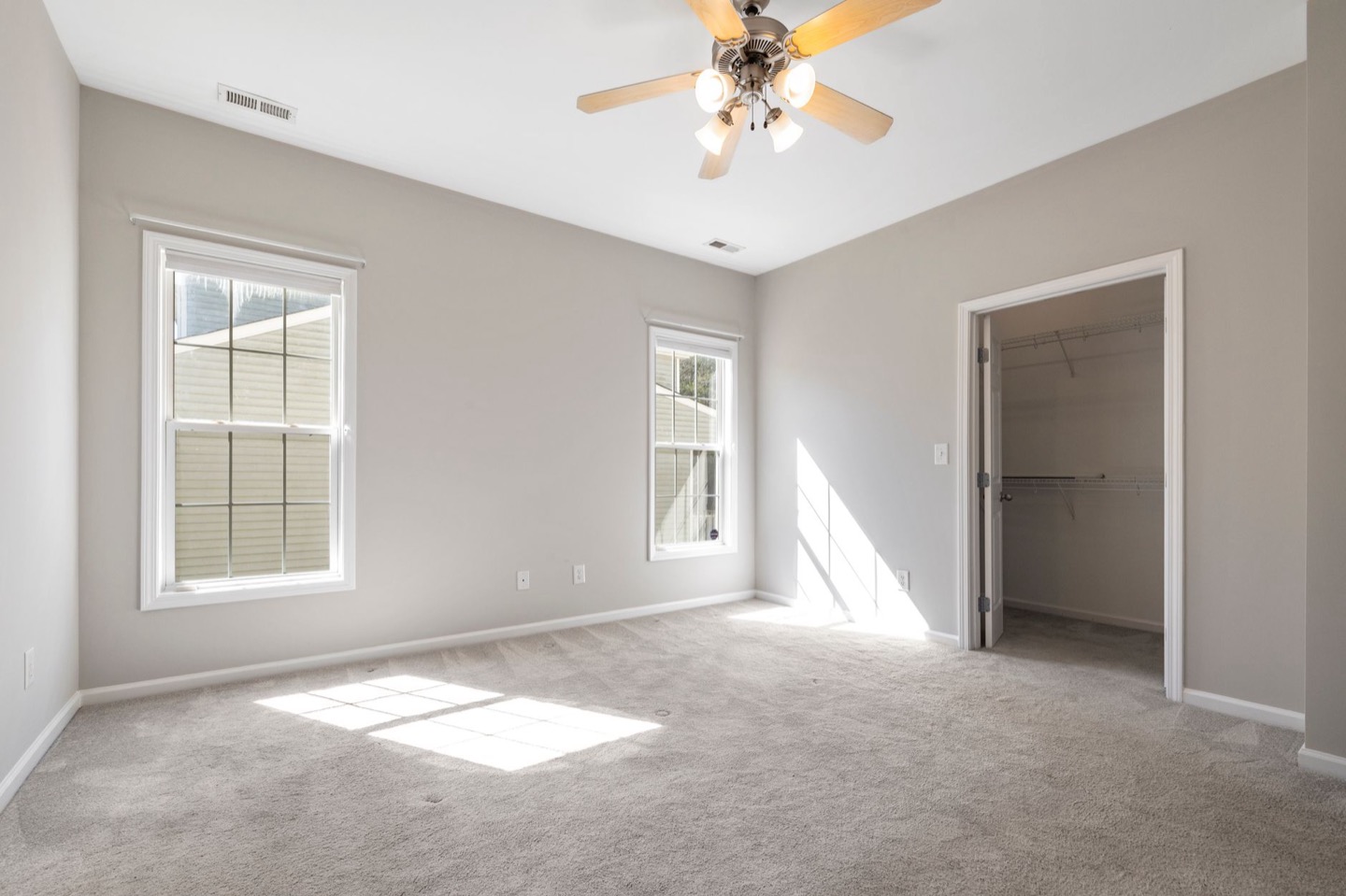 Before
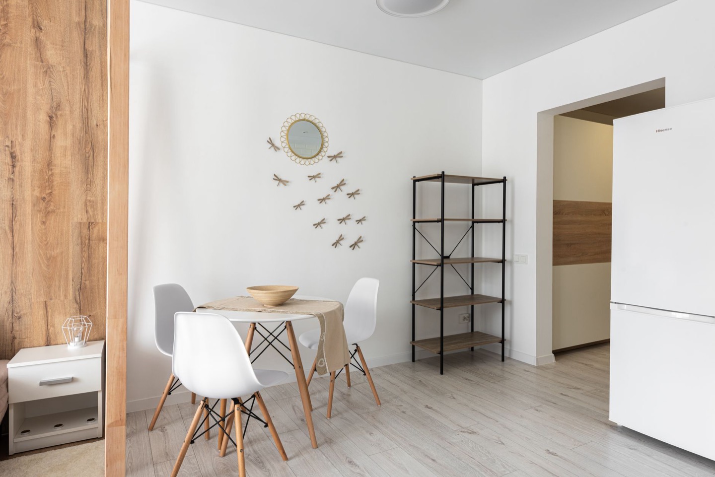 After
Side by side
| Pure White SW 7005 | Alabaster SW 7008 | |
|---|---|---|
| LRV | About 84 | About 82 |
| Undertone | Nearly neutral; a hint of warmth | Creamy; noticeably warm |
| Feels like | Clean, bright, fresh | Soft, cozy, gentle |
| Next to white bedding | Blends | Can look slightly cream |
| In north light | Stays white; can go slightly gray | Stays warm |
| Under warm bulbs | Stays clean | Can go golden |
| Best for | Walls, trim, cabinets, ceilings, whole-house | Cabins, cool rooms, warm traditional styles |
Pure White is slightly brighter. Alabaster is slightly warmer. That's the whole story, but it plays out differently in each room.
Why a clean white works so well in rentals
It makes rooms look bigger. Wide-angle listing photos already stretch a room. Bright walls stretch it further, and space is one of the first things guests judge.
It works with any furniture. Rentals are often furnished piece by piece. A clean white backdrop makes mismatched items look like they belong together.
It's easy to touch up. One white across the property means one can of paint for every scuff.
It modernizes dated spaces. Swapping beige or tan walls for a clean warm white is one of the quickest ways to make an older rental look updated.
The danger is going too stark. Ultra-bright, cool whites look cold and empty in photos, like a property that's still being renovated. Pure White and Alabaster both avoid that, which is why they're so popular.
Pure White: when it wins
Whole-property color. Pure White is one of the most versatile whites there is. It works on walls, trim, doors, cabinets, and ceilings, and it behaves consistently across rooms with different light.
Kitchens and bathrooms. White cabinets, white tile, white quartz, and chrome fixtures are usually neutral or cool. Pure White sits next to them without making them look blue.
Rooms with white bedding. Bright white sheets and duvets are standard in rentals. Pure White walls let them look crisp rather than slightly off.
Modern, coastal, and Scandinavian styles. Black accents, light wood, rattan, and linen all look sharp against Pure White.
Rooms with lots of warm light. In south- or west-facing rooms, warm sunlight adds plenty of warmth already. Pure White keeps the room from turning cream.
Alabaster: when it wins
Cabins and wood-heavy interiors. Next to knotty pine, log walls, and wood ceilings, Pure White can look a little stark. Alabaster shares their warmth and softens the contrast.
Cool north-facing rooms. Northern light pulls warmth out of walls. Alabaster has enough to spare.
Cozy, traditional, or farmhouse styling. Cream linens, brass, and vintage rugs look right with Alabaster.
Rooms where you want soft, not crisp. Bedrooms meant to feel restful can benefit from Alabaster's gentler tone, as long as the bedding isn't stark white.
For how Alabaster compares with Benjamin Moore's most popular warm white, see our White Dove vs Alabaster comparison.
How each one photographs
- Bright daylight: Pure White looks fresh and bright; Alabaster looks soft and creamy.
- North light: Pure White can look slightly gray in dim corners; Alabaster stays warm.
- Lamps on, 2700K bulbs: Pure White stays clean; Alabaster can look golden.
- Phone camera auto-white-balance: Pure White is more consistent.
For hosts shooting their own listing photos with a phone, Pure White's consistency is a real benefit.
Trim, ceilings, and cabinets
This is where Pure White really shines.
Pure White as trim: it works as a trim color for almost any wall color, from warm greige to soft white to deeper colors. It's crisp without being cold.
Pure White on ceilings: a clean, bright ceiling that doesn't look stark next to warm walls.
Pure White on cabinets: one of the most popular cabinet whites, because it looks fresh without looking clinical.
Alabaster as trim: best when walls are also Alabaster, or when walls are a warm color like beige or cream. Next to cool grays, Alabaster trim can look yellow.
A popular approach is walls and trim in the same white, in different sheens: eggshell on walls and semi-gloss on trim. Our eggshell vs satin guide has the full finish plan.
Pairing guide
Pure White pairs well with:
- Agreeable Gray, Repose Gray, or Accessible Beige walls (as trim)
- Black window frames and hardware
- Light oak and white oak
- Navy, sage, and terracotta accents
- White and light-gray bedding
Alabaster pairs well with:
- Accessible Beige or warm greige walls (as trim)
- Walnut, cherry, and honey-toned wood
- Brass and aged gold
- Rust, olive, and camel accents
- Cream, oatmeal, and natural linen bedding
Room by room
- Living room: Pure White for bright, modern spaces; Alabaster for cozy, wood-heavy spaces.
- Bedrooms: Pure White with white bedding; Alabaster with cream linens.
- Kitchen: Pure White on walls and cabinets.
- Bathrooms: Pure White, nearly always.
- Hallways: Pure White for consistency across the property.
- Cabin great room: Alabaster.
Common mistakes
Mixing them on adjacent walls. Side by side, Pure White makes Alabaster look yellow, and Alabaster makes Pure White look gray. Choose one per open space.
Pairing Alabaster with stark white bedding and tile. The cream reads dingy by comparison.
Judging from a tiny chip. Whites only show their undertones at scale. Paint a large swatch, at least 2 by 2 feet.
Ignoring the floor. An orange-toned floor can push Alabaster toward yellow. Hold the sample at floor level and at eye level.
Also considering Benjamin Moore?
If you're open to other brands, two Benjamin Moore whites are worth comparing: White Dove (soft, slightly gray) and Swiss Coffee (creamy). Our Swiss Coffee vs White Dove guide covers both. Roughly: Pure White sits between White Dove and Chantilly Lace in brightness, and Alabaster sits close to Swiss Coffee in warmth.
How it plays out in three common rentals
A modern townhouse with white oak floors and a white kitchen. Pure White on every wall, trim, and ceiling. One white keeps touch-ups simple, and the house photographs bright and current.
A lakeside cabin with pine paneling in the living room and drywall bedrooms. Alabaster on the drywall in the bedrooms shares the warmth of the pine and keeps the cabin feeling cozy. Pure White there would look stark against the wood.
A historic row house with deep windowsills and north-facing bedrooms. In the north bedrooms, Alabaster keeps the rooms from looking gray. In the bright south-facing living room, Pure White prevents the room from turning cream in afternoon light. Doors between the rooms keep the two whites from clashing.
Exterior trim and doors
Many hosts also repaint exterior trim and front doors before listing, since the exterior is often the first photo. Pure White is a popular exterior trim color because it looks clean against most siding colors without glowing like a stark white. Alabaster can look lovely on warm-toned brick or cream siding. As with interiors, test a sample on the actual house, in morning and afternoon light, before committing.
Quick decision checklist
- One white for the whole property? → Pure White
- White kitchen, white tile, white bedding? → Pure White
- Trim color for any wall color? → Pure White
- Cabin or wood-paneled room? → Alabaster
- Cool north light? → Alabaster
- Cream linens and warm wood? → Alabaster
Preview before you paint
Preview both whites on a photo of your actual room with our free wall color tool. For the full picture, walls, bedding, and furniture together, restyle your room and get paint codes for the version you like.
See your white on your walls first
Upload a photo of your rental and preview it restyled, with wall color, bedding, and furniture together. First room is free.
Restyle My Room$29 per additional room · One-time · No subscription
FAQ
Is Pure White or Alabaster warmer? Alabaster is warmer and creamier. Pure White is a nearly neutral white with a slight warm undertone.
Is Pure White too stark? No. It has just enough warmth to avoid looking cold. It's much softer than Extra White or ultra-bright whites.
Which is better for kitchen cabinets? Pure White is the more popular choice for cabinets because it looks clean without looking clinical. Alabaster suits warmer, traditional kitchens.
Can I use Pure White trim with Alabaster walls? It can work, but it makes Alabaster look creamier. Many designers use Alabaster on both walls and trim for a softer look.
Which white looks best in listing photos? Pure White is more consistent on camera, especially in phone photos with lamps on. Alabaster looks lovely in warm, cozy rooms if lighting is controlled.