Agreeable Gray and Accessible Beige are the two most-recommended Sherwin-Williams neutrals of the last decade, and they sit so close on the fan deck that most hosts pick one at random. That's a mistake in a rental, because the small difference between them shows up exactly where it costs you: in listing photos, under mixed lighting, next to whatever floor the previous owner left behind.
Here's the short answer, then the detail you need to choose with confidence.
The verdict: Pick Agreeable Gray (SW 7029) if your rental has cool or neutral floors, lots of white trim, or north-facing light, and you want the safest "goes with anything" wall. Pick Accessible Beige (SW 7036) if you have warm wood floors, south or west light, and you want a cozier, more lived-in feel in photos. If you're unsure, Agreeable Gray is the lower-risk choice for a property you'll photograph and furnish over time.
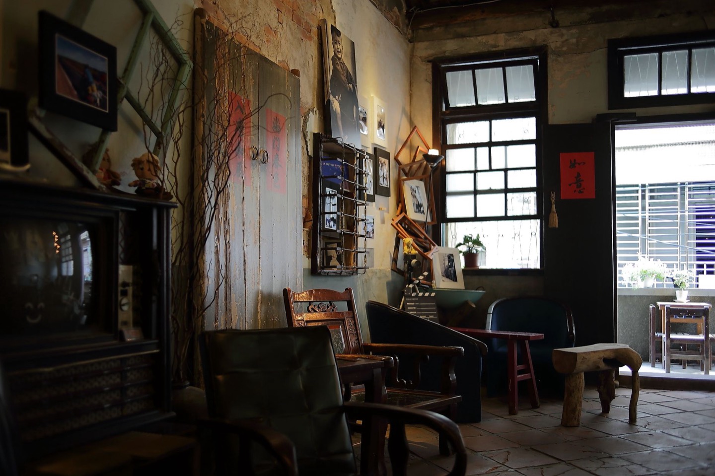 Before
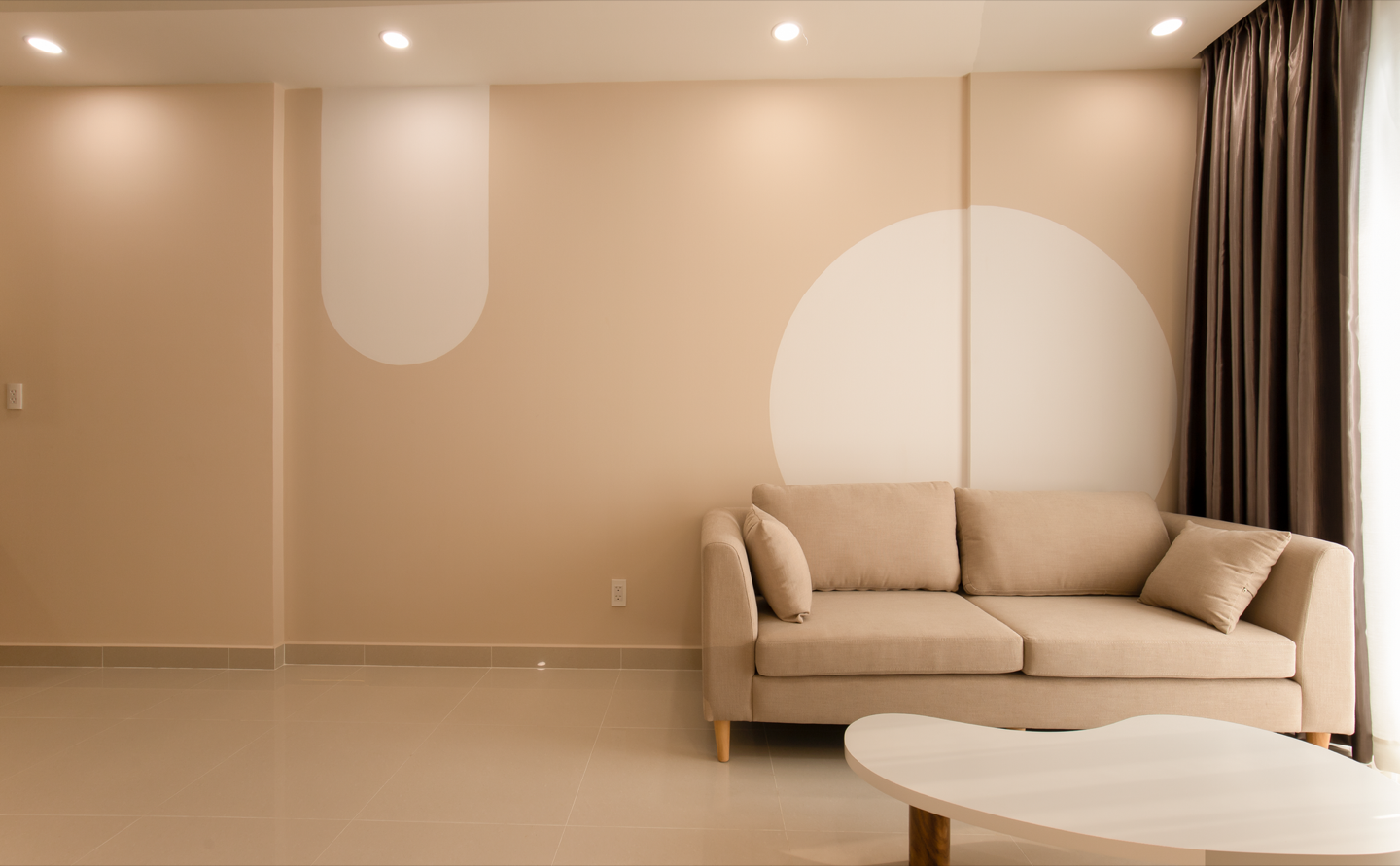 After
The two colors side by side
| Agreeable Gray SW 7029 | Accessible Beige SW 7036 | |
|---|---|---|
| Family | Greige (gray-leaning) | Greige (beige-leaning) |
| LRV | About 60 | About 58 |
| Undertone | Soft warm gray; can flash faint green or violet in cool light | Warm sand; can flash green in north light |
| Feels like | Clean, neutral, quietly modern | Cozy, soft, a little traditional |
| Best floors | Gray LVP, white oak, cool tile | Honey oak, walnut, warm LVP |
| Risk in photos | Can read flat or slightly cold on overcast days | Can read yellow-beige next to bright white bedding |
The LRV (light reflectance value) numbers are almost identical. That means neither color will make a room noticeably brighter or darker than the other. The decision comes down to undertone, and to what else is in the room.
Why undertone matters more in a rental than at home
At home, you live with a wall color in every light, every day, and your eye adjusts. Guests don't. They see your room first as a thumbnail on a phone screen, taken at one moment in one light, and they decide in a second or two whether it looks inviting.
A camera is also less forgiving than your eye. Phone cameras auto-correct white balance, and they tend to exaggerate whatever undertone a wall has. A greige that looks perfectly balanced in person can come out faintly green or faintly pink in a listing photo. That's the real reason this comparison matters: you're choosing the color that photographs best, not just the one that looks nicest in person.
We covered the wider rule in our guide to the best paint colors for a bedroom: warm undertones nearly always beat cool ones in rental photos. Both of these colors pass that test. The question is how much warmth your room can carry.
Agreeable Gray: when it wins
Agreeable Gray is the default for a reason. It's a true middle greige: warm enough not to feel cold, gray enough not to feel dated. In a rental, three situations make it the clear pick.
1. You have gray or cool-toned floors. A lot of flipped and investor-renovated properties have gray luxury vinyl plank. Accessible Beige next to cool gray flooring can look like a mismatch, with the walls reading yellow against the floor. Agreeable Gray bridges the two.
2. You're painting the whole property one color. Many hosts paint every room the same wall color so touch-ups are simple. Agreeable Gray adapts better across rooms with different light, from a dim hallway to a bright kitchen, without changing personality too much.
3. Your furnishing style is modern, coastal, or Scandinavian. Crisp white bedding, light oak, black metal, and linen all look intentional against Agreeable Gray. It's the backdrop most "clean modern" listing photos are shot against.
Where it can go wrong: In a north-facing room on a gray day, Agreeable Gray can slide toward a flat, slightly cold gray. If your best bedroom faces north and you shoot photos in winter, test it before committing.
Accessible Beige: when it wins
Accessible Beige is warmer and softer. In the right room it photographs as genuinely cozy, which is exactly what many cabin, farmhouse, and mountain rentals are selling.
1. You have warm wood floors. Honey oak, cherry, and walnut floors can make Agreeable Gray look a little cool and disconnected. Accessible Beige shares their warmth, so the room reads as one palette.
2. Your rental is a cabin, lake house, or "cozy retreat." If the listing sells warmth, firelight, and wool throws, Accessible Beige supports that story. Agreeable Gray can make those rooms look like a model home.
3. Your room gets strong south or west light. Bright, warm afternoon light keeps Accessible Beige reading as a soft sand color, not as yellow.
Where it can go wrong: Next to bright optical-white bedding, towels, and trim, Accessible Beige can look dingier than it really is. If your linens are hotel white (and in a rental they usually should be), pair this color with a slightly warmer trim white so the contrast isn't harsh.
How each one photographs
This is the part most paint comparisons skip, and it's the one that matters most for bookings.
- Daylight, lamps off: Both colors look excellent. Agreeable Gray looks crisp; Accessible Beige looks soft.
- Overcast day: Agreeable Gray can drift cool. Accessible Beige holds its warmth better.
- Lamps on at dusk (2700K bulbs): Agreeable Gray warms up nicely and looks balanced. Accessible Beige can turn noticeably golden.
- Phone camera, auto white balance: Agreeable Gray is more predictable. Accessible Beige is more likely to shift in color from shot to shot.
If you're shooting your own listing photos, predictability is worth a lot. A wall that looks the same in every photo makes the whole listing look more consistent and more professional.
Room-by-room recommendations
Primary bedroom: Agreeable Gray if your bedding is bright white; Accessible Beige if you use cream or oatmeal linens and warm wood furniture.
Living room: Agreeable Gray for open-plan rentals that connect to a white kitchen. Accessible Beige for cabins with a stone fireplace or wood-paneled accents. If you're going for the warm minimal look, our warm minimal Airbnb living room guide pairs well with either, but slightly better with Accessible Beige.
Kitchen: Agreeable Gray, almost always. It sits more comfortably next to white cabinets, stainless steel, and quartz.
Bathrooms: Agreeable Gray. Bathrooms usually have cool white fixtures and cool light, which can push Accessible Beige toward yellow.
Hallways and stairwells: Agreeable Gray. These spaces are usually dim, and you want the more neutral option where light is weakest.
What trim and ceiling color to use
- With Agreeable Gray: Sherwin-Williams Pure White (SW 7005) or Extra White (SW 7006) on trim, and a flat white ceiling. The contrast stays crisp.
- With Accessible Beige: Sherwin-Williams Alabaster (SW 7008) or Pure White on trim. Avoid stark Extra White, which makes the beige look dirtier by comparison.
Use eggshell on walls and semi-gloss on trim. Eggshell wipes clean between guests and still photographs flat.
Three mistakes hosts make with these colors
Mixing them on adjoining walls. Side by side, each makes the other look wrong: Agreeable Gray looks cold and Accessible Beige looks yellow. Pick one per open space.
Choosing from a chip under store lights. Fluorescent store lighting is cool and flat, and it hides the undertones that show up in your room. Always judge on your own wall, in your own light.
Ignoring the floor. The floor is the biggest surface in most listing photos after the walls. Hold a sample against the floor before you decide. If the wall and floor fight, no amount of styling fixes it.
How to choose in your actual room
You don't need to buy two gallons to decide. The fastest route:
- Take a wide photo of the room in daylight from the corner you'd use for your listing photo.
- Preview both colors on that photo. Our free wall color tool shows how each one reads on your actual walls, in your light, without paint.
- Narrow it to one, then buy a single sample pot and paint a large swatch near the window and another in the darkest corner.
- Photograph both swatches with your phone at the time of day you'd shoot the listing. Decide from the photos, not from standing in the room.
We walk through this whole process in how to test Airbnb paint colors before you buy a can.
The bottom line
Both colors are safe, and both photograph better than the builder white or dated taupe most rentals come with. If you want the lowest-risk choice for a property you'll furnish in a clean, modern style, choose Agreeable Gray. If your rental sells warmth, wood, and coziness, choose Accessible Beige and pair it with a warmer trim white.
Before you paint anything, see the finished room. Restyle your room to preview the walls, bedding, and furniture together, so the paint is part of a plan and not a guess.
See both colors in your room before you paint
Upload a photo of your rental. Preview the walls, furniture, and styling together, and get exact paint codes for the version you like. First room is free.
Restyle My Room$29 per additional room · One-time · No subscription
FAQ
Is Agreeable Gray or Accessible Beige warmer? Accessible Beige is warmer. It leans sand and beige, while Agreeable Gray leans gray with just enough warmth to avoid feeling cold.
Which one is lighter? They're nearly identical. Agreeable Gray has an LRV of about 60 and Accessible Beige about 58, a difference most people can't see on the wall.
Do either of them look green? Both can flash a faint green in cool north light, and Accessible Beige is a little more prone to it. Testing a large swatch in your own light is the only reliable way to know.
Which is better for resale or long-term rentals too? Agreeable Gray is the more universal choice. It works with more floor colors and furniture styles, which matters if you might change how the property is used later.
Can I use one color in bedrooms and the other in living areas? Yes, but keep them in separate zones divided by a door or a clear break. Side by side on adjoining walls, the difference makes both colors look slightly off.