If you've decided your rental should be white, you've already made a good call. A warm white makes small rooms feel bigger, makes cheap furniture look more deliberate, and photographs bright without looking clinical. The harder question is which warm white, and two names come up more than any others: Benjamin Moore White Dove and Sherwin-Williams Alabaster.
They look almost the same on a paint chip. On a wall, in a listing photo, next to white bedding, they don't.
The verdict: Choose White Dove (OC-17) if you want a soft white that stays white: it has a slight gray undertone that keeps it from going yellow, so it works in most rooms and most light. Choose Alabaster (SW 7008) if you want a creamier, cozier white for warm-wood cabins and rooms with cool north light. For a whole-house rental color, White Dove is the safer pick.
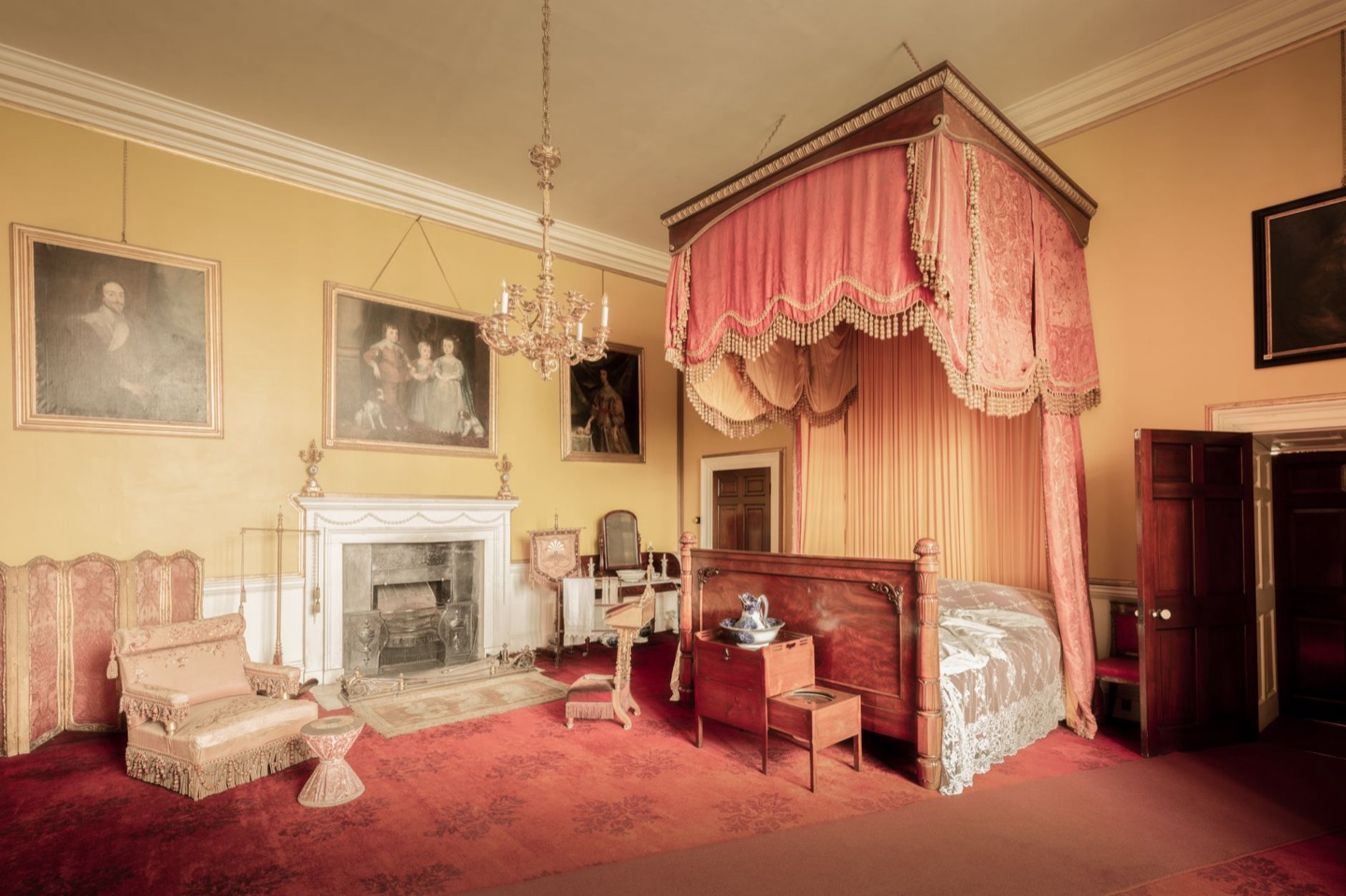 Before
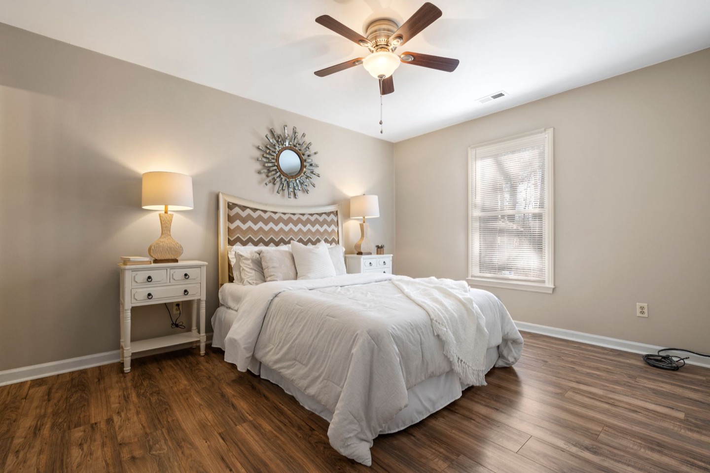 After
Side by side
| White Dove OC-17 | Alabaster SW 7008 | |
|---|---|---|
| Brand | Benjamin Moore | Sherwin-Williams |
| LRV | About 85 | About 82 |
| Undertone | Soft greige; warm but balanced | Cream; noticeably warmer, slight yellow |
| Feels like | Clean, calm, hotel-like | Soft, cozy, a little vintage |
| Best with | White bedding, light oak, black accents | Warm wood, linen, brass, stone |
| Risk | Can look slightly gray in very dim rooms | Can look yellow next to bright white linens |
White Dove is a touch brighter. Alabaster is a touch warmer. Everything else follows from those two facts.
Why white walls are such a strong choice for rentals
Before choosing between them, it helps to know why so many well-booked listings use a warm white in the first place.
It makes rooms look larger in photos. Wide-angle listing shots already stretch a room; light walls push the effect further, and guests filter heavily by how spacious a place looks.
It forgives mismatched furniture. Most rentals are furnished over time. A warm white backdrop makes pieces from different stores look like they belong together.
It makes touch-ups simple. Guest turnover means scuffs. A common white is easy to match, easy to touch up, and doesn't show patchy repairs the way deeper colors do.
The catch is that stark, optical white does the opposite of what you want on camera. It photographs cold and empty, like a listing that hasn't been finished. That's why the choice comes down to warm whites, and why we lean warm in our guide to the best bedroom paint colors.
White Dove: when it wins
White Dove's slight gray undertone is its superpower. It keeps the color from turning yellow, even under warm 2700K bulbs.
Bedrooms with bright white bedding. In a rental, white bedding is the standard because it signals "fresh and clean." White Dove sits right next to hotel-white sheets without making them, or the wall, look off.
Modern, Scandinavian, or coastal styling. Light oak, linen, rattan, and matte black all look crisp against White Dove. If you're following our Scandinavian bedroom under $500 plan, White Dove is the wall color we'd pair with it.
Kitchens and bathrooms. White cabinets, white tile, and chrome fixtures are usually cool or neutral. White Dove blends with them; Alabaster can make them look slightly blue by comparison.
Whole-house color. If you want one wall color in every room so cleaners and handymen can touch up anywhere, White Dove adapts better from bright rooms to dim ones.
Alabaster: when it wins
Alabaster is warmer and creamier, and in the right room that warmth is exactly what makes a listing feel inviting.
Cabins and mountain rentals. Knotty pine, log walls, wood ceilings and stone fireplaces all have strong warm tones. White Dove can look slightly gray beside them; Alabaster blends in.
North-facing rooms. Cool northern light pulls warmth out of a wall. Alabaster has enough warmth to spare, so it still reads as a soft white rather than a dull gray.
Rooms with cream or oatmeal textiles. If you've chosen linen-colored bedding, wool throws, and jute rugs, Alabaster ties them together.
Where it goes wrong: Next to bright white trim, crisp white towels, and white quartz, Alabaster can look yellow or even dingy. If you choose it, paint the trim the same color (in semi-gloss) instead of a brighter white.
How each one photographs
- Midday daylight: Both look excellent. White Dove looks bright and clean; Alabaster looks soft and warm.
- North light or an overcast day: White Dove can slip toward light gray. Alabaster holds as white.
- Lamps on, warm bulbs: White Dove stays balanced. Alabaster can go noticeably golden, which looks cozy in person but can look yellow in photos.
- Phone camera auto-white-balance: White Dove is more consistent from shot to shot.
For hosts who shoot their own photos across different times of day, White Dove's consistency is a real advantage.
What about trim?
- White Dove walls: Use White Dove on trim too, in semi-gloss, for a soft, seamless look. Or use Benjamin Moore Chantilly Lace on trim for a crisper edge.
- Alabaster walls: Use Alabaster on the trim in semi-gloss. A brighter trim white makes Alabaster look dirty by comparison.
Painting walls and trim the same color in different sheens is a designer move that also simplifies maintenance in a rental: one color to stock, one color to touch up.
Which sheen to use
In a rental, sheen matters almost as much as color. Flat paint looks beautiful but marks the first time a suitcase hits the wall, and it can't be scrubbed. Satin and semi-gloss wipe clean but add a sheen that shows every bump in the drywall in wide-angle photos.
- Walls: eggshell. It wipes clean between guests and still photographs as a flat, even color.
- Trim, doors, and window casings: semi-gloss. These surfaces take the most hands and luggage.
- Ceilings: flat white or the wall color in flat. A flat ceiling hides imperfections in overhead photos.
- Bathrooms: a moisture-resistant eggshell or satin made for bathrooms, especially if guests take long showers without running the fan.
What to pair with each white
A warm white wall is a backdrop, and the rest of the room decides whether it looks expensive or empty.
With White Dove, lean into contrast: light oak or ash furniture, black metal lamps and frames, linen in white and soft gray, and one muted accent color, like sage or dusty blue, in a rug or throw. This is the clean, calm look most modern listings are going for.
With Alabaster, lean into texture and warmth: walnut or honey-toned wood, brass or aged-gold hardware, cream bouclé or wool, jute rugs, and terracotta or rust accents. This is the look that makes a cabin or cottage feel collected over time rather than bought in one weekend.
Either way, avoid filling a white room with more white. A white wall, white bed, white rug and white chair photographs as flat and unfinished. You need at least one mid-tone (wood, a rug, art) and one dark note (a lamp base, a frame, a black handle) for the camera to read depth.
Real room combinations that work
- Beach condo bedroom: White Dove walls, white bedding, rattan headboard, sea-glass blue throw, light oak nightstands.
- City apartment living room: White Dove walls and trim, charcoal sofa, black floor lamp, warm-white 2700K bulbs, one large piece of abstract art.
- Mountain cabin bedroom: Alabaster walls with Alabaster trim, walnut bed frame, cream wool blanket, plaid accent pillow, brass reading lamps.
- Farmhouse kitchen: Alabaster walls, butcher-block counters, aged-brass pulls, open wood shelving with white dishes.
A note on consistency across the property
If you choose White Dove for the bedrooms and Alabaster for a cabin-style living room, keep the two in separate rooms divided by doors. Side by side on connected walls, each makes the other look off: White Dove looks gray and Alabaster looks yellow. It's another reason many hosts choose a single white for the whole property.
When neither is right
If your room is very dark, with one small north-facing window, both whites can end up looking gray, because white needs light to look white. In that case, a light warm greige often looks brighter in photos than a white does. Our Agreeable Gray vs Accessible Beige comparison covers the two best options.
If your room is very bright, with big south-facing windows, both whites can look blown out in photos. A slightly deeper off-white or a light greige will give the camera more to work with.
How to decide in 10 minutes
- Photograph the room in daylight, wide, from your best listing angle.
- Preview both whites on your photo with our free wall color tool.
- Hold your actual bedding and a towel next to the screen. Whichever white makes the linens look cleanest is your color.
- Buy one sample and paint a large swatch to confirm.
Want to see the full room, not just the walls? Restyle your room to preview paint, bedding, and furniture together, with paint codes included.
Pick your white with the whole room in view
Upload a photo of your rental and preview it restyled, including wall color, bedding, and furniture. First room is free.
Restyle My Room$29 per additional room · One-time · No subscription
FAQ
Is White Dove or Alabaster warmer? Alabaster is warmer and creamier. White Dove is a soft white with a slight gray undertone that keeps it from looking yellow.
Which white is brighter? White Dove, slightly. Its LRV is about 85 compared with about 82 for Alabaster.
Can I get White Dove color-matched at Sherwin-Williams? Color-matching is possible, but the result rarely matches exactly because paint bases differ. For a rental you'll touch up for years, buy the original brand so every future can matches.
Is White Dove good for kitchen cabinets? Yes. It's one of the most popular cabinet whites because it reads clean without looking stark. Use a durable cabinet enamel in satin or semi-gloss.
Which white hides scuffs better? Both hide scuffs about equally in eggshell. Alabaster's warmth slightly disguises dust and marks in warm light, but the bigger factor is using a washable eggshell rather than flat paint.