Paint is the highest-ROI change you can make to an Airbnb bedroom. A single gallon covers a room, changes how every piece of furniture photographs, and alters the first impression of your listing for years. The wrong color costs you bookings every day until you repaint. The right one improves your click-through rate the day new photos go live.
The specific color matters — and the right color depends on how your room is oriented, how much natural light it gets, and what look you're going for. This guide gives you specific picks by room type, the finish that works in rentals, and the single most important rule that most hosts break.
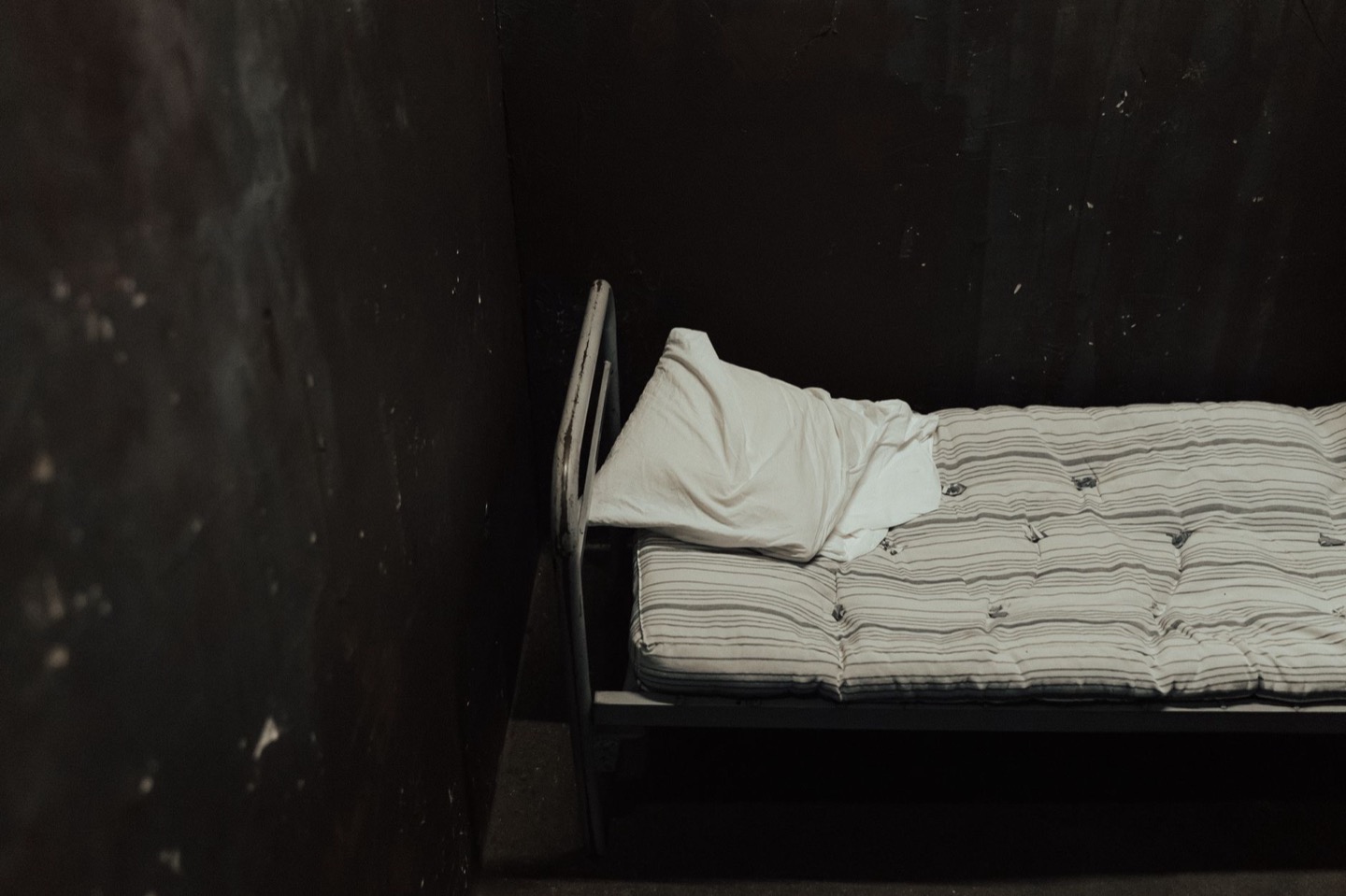 Before
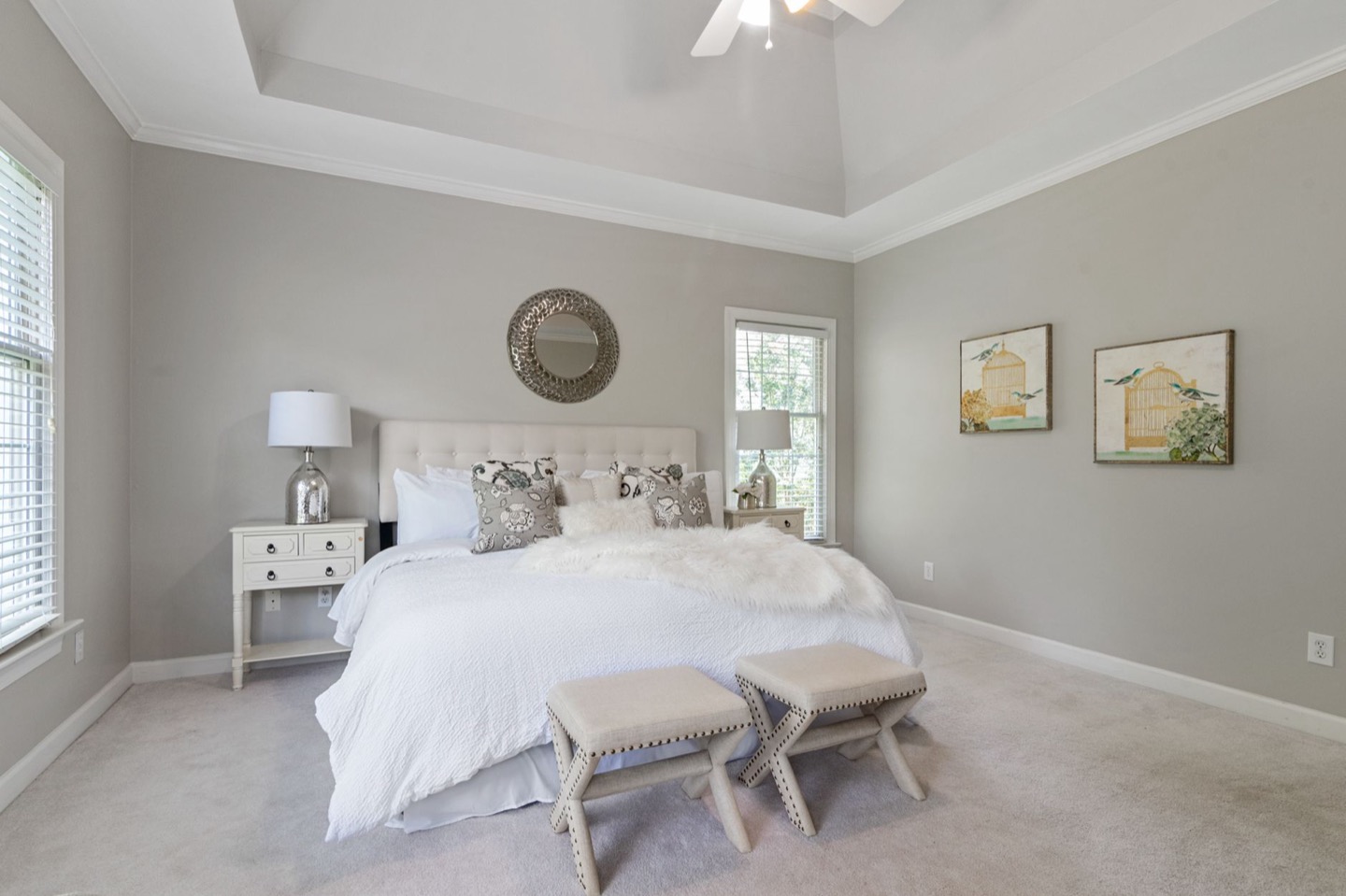 After
Quick picks: the best bedroom paint colors at a glance
| Your bedroom | Best pick | Why it works |
|---|---|---|
| Bright, south or west light | Sherwin-Williams Accessible Beige SW 7036 | Warm sand that holds up in strong sun without going yellow |
| Dim, north or east light | Benjamin Moore White Dove OC-17 | Creamy white that bounces light instead of turning grey |
| Small room or studio | Benjamin Moore Chantilly Lace OC-65 | Clean, barely-warm white that makes walls recede |
| Boutique or moody look | Farrow & Ball Hague Blue No. 30 | Deep navy that photographs rich with warm wood and brass |
| Hard-working rental | Sherwin-Williams Alabaster SW 7008 | Soft warm white that hides scuffs and touches up cleanly |
If you only read one line: pick a warm-undertone neutral that suits how much light the room gets, and paint it in eggshell. The rest of this guide explains how to choose between them, and which popular colors to skip.
The one rule: warm undertone always
The most common paint mistake in Airbnb bedrooms is choosing bright white or cool grey. Both photograph cold and clinical — the opposite of "inviting." Guest listings in the $100–$250/night range that use cool-toned wall colors perform measurably worse in search than rooms painted in warm neutrals, because the thumbnail reads as less appealing.
The rule: every wall color should have a warm undertone. That means leaning toward cream, sand, blush, taupe, or warm grey — never blue-grey, slate, or bright optical white.
This rule holds across every room type and style direction. Even a "white" bedroom should use a warm white, not a bright or optical white.
By room type: which color to use
Rooms with good natural light (south or west-facing windows)
These rooms can handle slightly deeper tones without going dark.
Best picks:
- Sherwin-Williams "Accessible Beige" SW 7036 — sandy warm neutral, reads beautifully in afternoon light
- Benjamin Moore "Pale Oak" OC-20 — slightly pink-beige, one of the most flattering in warm light
- Farrow & Ball "Elephant's Breath" — the elevated pick; reads differently as light changes through the day
Avoid: Bright white (will look blown-out in direct sun) or any cool grey (will look cold by comparison with warm-toned fixtures).
Rooms with limited natural light (north or east-facing windows)
These rooms need a wall color that bounces whatever light is available rather than absorbing it.
Best picks:
- Benjamin Moore "White Dove" OC-17 — the most forgiving warm white in low light; creamy without being yellow
- Sherwin-Williams "Alabaster" SW 7008 — warmer than White Dove, excellent in east-facing rooms that get morning light
- Benjamin Moore "Cloud White" OC-130 — slightly off-white with warm undertone, reliable in any light level
Avoid: Beiges with a green or yellow cast (they look muddy in low light). Test before you buy.
Small rooms or studios
In small rooms, wall color does double duty: warmth and the illusion of space.
Best picks:
- Benjamin Moore "White Dove" OC-17 — keeps the room feeling bright and open
- Sherwin-Williams "Eider White" SW 7014 — warm grey-white that makes tight rooms feel intentional rather than small
- Benjamin Moore "Chantilly Lace" OC-65 — the cleanest warm white; pairs with any furniture color
The ceiling trick: Paint the ceiling the same color as the walls (or one shade lighter). It blurs the ceiling line and makes low ceilings feel taller — visible in listing photos and noticeable to guests on arrival.
Rooms going for a dramatic or boutique-hotel look
Some hosts want to go beyond neutral — an accent wall, a moody tone that photographs with character.
Best picks for drama:
- Farrow & Ball "Hague Blue" No.30 — deep navy, beautiful with warm wood and brass; high-risk, high-reward
- Benjamin Moore "Black Beauty" 2128-10 — for an all-dark approach; only works with excellent lighting
- Sherwin-Williams "Dusty Miller" SW 7846 — muted sage green, earthy and distinct without being trendy
Important: If you go dark or dramatic, your lighting budget must increase to compensate. Dark walls absorb light — you need more lamps, warmer bulbs, and more ambient light sources than a neutral room requires.
Finish: eggshell, always
In a rental, the finish is non-negotiable: eggshell. Not matte, not flat, not satin.
- Matte marks easily and can't be wiped clean — it's the wrong choice for a space with guest turnover
- Satin is too shiny and photographs with a slight sheen that reads as cheap in wide shots
- Eggshell is wipeable, durable, and reads as flat in photos while being practical in real use
Every color on this list works in eggshell. If a paint store tries to sell you flat paint for a bedroom, redirect to eggshell.
How to test before you paint
The mistake that costs hosts the most: buying a full gallon of paint, painting the room, and discovering it reads wrong in photos.
The process that works:
- Get samples of your top two colors (small cans, usually $3–$5 each)
- Paint two 12x12 swatches on the actual wall — near the window and in the darkest corner
- Photograph both swatches under listing conditions: mid-morning, lamps on, overhead off
- Look at the photos (not the swatches in person) and decide from there
What a color looks like on a screen in a paint store is not what it looks like on your wall in your specific light. Your phone camera will catch a cool undertone that your eye misses. Test first.
For an even faster way to see how a color reads in your specific room: preview three warm neutral options on your actual wall photos before opening a sample can.
The colors to avoid
Anything with a green undertone. Benjamin Moore "Revere Pewter" (HC-172) has a green cast that reads muddy in photos despite being wildly popular. The Airbnb listing graveyard is full of Revere Pewter bedrooms.
Bright white. Pure optical white (like Benjamin Moore "Ultra White") photographs cold in every condition. It signals "vacant staging" rather than "curated space."
Dark accent walls without a lighting plan. A dark feature wall behind the bed is a legitimate look — but without enough warm ambient light, it makes the room look dim and the bed look small in listing photos.
Trendy colors that date. Millennial pink, dusty rose, and the color of the year tend to look dated within 18–24 months. If you're painting a rental, choose a color that will look relevant in 2029. Warm neutrals and classic deep tones survive trends; anything that "feels of the moment" usually doesn't.
After the paint: the full restyle
Paint is the start, not the finish. Once the walls are right, use the design planner to scope the furniture, textiles, and lighting that completes the room — or preview the finished bedroom before buying anything. The before/after at the top of this post was achieved with paint plus targeted changes to the bedding and lamps: same furniture, same floor plan, different everything in photos.
See how three warm neutrals look in your specific bedroom
Upload a photo of your room. Preview how different paint colors read before opening a sample can. Free.
Preview Paint in My Room$29 per additional room · One-time · No subscription
FAQ
Should I paint the whole room or just an accent wall? For most Airbnb bedrooms, painting all four walls the same warm neutral produces better photos than a single accent wall. An accent wall can work well — dark tone behind the headboard, warm neutral on the remaining walls — but it requires a confident paint choice and good lighting to execute.
How long does paint off-gas before I can photograph and rent? Most low-VOC latex paints are dry to the touch in 1–2 hours and photo-ready in 24 hours. For guest-ready, wait 72 hours minimum with good ventilation.
Does paint color affect guest reviews? Indirectly — a warm-toned room is more likely to receive words like "cozy," "beautiful," and "well-designed" in reviews. Cool-toned or clinical spaces receive functional reviews ("clean," "convenient") even when they're equally clean. Over 50+ reviews, the difference compounds.
What if my rental is furnished and I can't repaint? Focus on textiles. Warm-toned bedding, curtains, and a rug can shift the perceived wall color in photos by adding warmth that photographs around cool walls. It's not as effective as repainting, but a cream linen duvet against a cool-grey wall reads warmer than bare grey.