Agreeable Gray and Repose Gray are neighbors on the Sherwin-Williams fan deck and two of the best-selling grays in America. Contractors love both. Flippers love both. And most rentals painted in the last eight years have one or the other on the walls.
They're not interchangeable, though. One is a warm greige that leans cozy. The other is a cooler, slightly deeper gray that leans modern, and that coolness is exactly what can make a rental look cold in listing photos.
The verdict: For most short-term rentals, choose Agreeable Gray (SW 7029). It's warmer, a touch lighter, and more forgiving on camera. Choose Repose Gray (SW 7015) only if your rental is deliberately modern or industrial, has lots of warm light, or has warm wood floors that need a cooler wall to balance them.
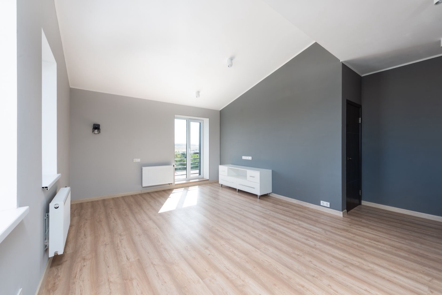 Before
 After
Side by side
| Agreeable Gray SW 7029 | Repose Gray SW 7015 | |
|---|---|---|
| Family | Greige (warm gray) | Gray (cool-leaning neutral) |
| LRV | About 60 | About 58 |
| Undertone | Warm, with a faint green or violet flash in cool light | Cooler, can flash blue, violet, or green |
| Feels like | Soft, cozy, safe | Crisp, modern, calm |
| Best with | Most floors and styles | Warm wood, black and white, industrial |
| Risk | Can look slightly beige next to cool tile | Can look cold or blue in north light and in photos |
Repose Gray is a little deeper and a little cooler. On a wall, the difference is subtle. In a phone photo with auto white balance, it's often obvious.
Why cool grays struggle in listing photos
For about a decade, cool gray was the default "updated" color for flips and rentals. The problem is that cool gray photographs as cold, especially in the small, bright thumbnails guests scroll past.
Guests booking a getaway are buying a feeling: warmth, rest, comfort. A room that photographs blue-gray reads as clean but impersonal, closer to an office or a waiting room than a retreat. That's the core of our advice in the best bedroom paint colors guide: warm undertones nearly always photograph better in a rental.
Repose Gray isn't a cold gray, exactly. It's a balanced, slightly cool neutral. But it sits close enough to the cool side that the camera can push it there, especially on overcast days or in north-facing rooms.
Agreeable Gray: when it wins
Bedrooms. This is where warmth matters most. Agreeable Gray next to white bedding and warm lamp light reads restful. Repose Gray in the same room can read sterile.
North- and east-facing rooms. Cool northern light pulls color toward blue. Agreeable Gray has enough warmth to stay neutral; Repose Gray can look noticeably blue-gray.
Rentals marketed as cozy. Cabins, cottages, beach houses with natural textures, farmhouse style. Agreeable Gray supports wood, linen, rattan, and wool.
Whole-property color. If you want one wall color throughout, Agreeable Gray is more forgiving across rooms with different light and floors.
Repose Gray: when it wins
Strong warm light. South- and west-facing rooms with lots of afternoon sun can make Agreeable Gray look beige. Repose Gray holds a true gray in warm light.
Orange or red-toned wood floors. Older oak floors with an orange stain, or cherry floors, can make warm greiges look muddy. A slightly cooler gray like Repose balances the warmth.
Modern, urban, or industrial rentals. Black window frames, concrete, chrome, white subway tile and a monochrome palette suit Repose Gray. In a loft or a design-led city apartment, its cooler edge looks intentional.
Bathrooms with gray tile. If the tile is already a cool gray, Repose Gray connects with it. Agreeable Gray next to cool tile can look slightly yellow.
How each photographs
- Bright daylight: Both look clean. Repose Gray looks more like a "true gray."
- Overcast or north light: Agreeable Gray stays warm-neutral. Repose Gray can turn blue-gray.
- Lamps on, 2700K bulbs: Both warm up. Agreeable Gray goes cozy; Repose Gray becomes balanced.
- Phone auto-white-balance: Repose Gray is more likely to shift between blue and violet from shot to shot.
If you shoot your own listing photos, Agreeable Gray gives more consistent results. If a professional photographer handles your shoots and corrects color, the gap narrows.
The undertone flash, explained
Both grays are known for "flashing" undertones, meaning they look like a different color depending on the light.
- Agreeable Gray occasionally shows a faint green or violet hint in cool light. In most rooms it stays a warm greige.
- Repose Gray is more prone to flashing. Designers report blue in north light, violet next to warm wood, and green next to certain greens outdoors.
The only way to know which way a color will flash in your rental is to see it on your own walls. Paint a large sample (at least 2 by 2 feet) on two walls, and look at it morning and evening.
If your rental already has Repose Gray
Many hosts inherit Repose Gray from a previous owner or a flip. You don't necessarily need to repaint. Before you do, try warming up the room around it:
- Switch to 2700K bulbs. Warm light is the fastest way to stop a cool gray from looking cold.
- Add warm textiles. Cream or oatmeal throws, a jute or wool rug, and wood accents pull the room's overall temperature up.
- Add a warm wood element. A walnut nightstand, an oak bench, or a wood headboard balances the cool wall.
- Reshoot at golden hour or with lamps on. If the walls read cold in your current photos, light is often more of the problem than paint.
If the room still looks cold after those changes, repaint with Agreeable Gray. It covers Repose Gray easily because they're close in depth, often in a single coat with a quality paint.
Pairing guide
Agreeable Gray pairs with: Pure White (SW 7005) trim, white or cream bedding, light and mid-tone wood, sage green, terracotta, warm brass.
Repose Gray pairs with: Extra White (SW 7006) or Pure White trim, crisp white bedding, black metal, chrome, navy, charcoal, walnut.
Neighbor colors on the same strip: if you want Agreeable Gray but a little deeper, look at Worldly Gray (SW 7043). If you want Repose Gray but lighter, look at Passive (SW 7064) or the lighter Agreeable Gray itself.
The one-room test
Not sure which one fits? Here's a five-minute process:
- Take a wide photo of the room in daylight from your listing angle.
- Preview both grays on that photo with our free wall color tool.
- Look at the two versions side by side on your phone, at thumbnail size. Whichever looks warmer and more welcoming at small size wins.
- Confirm with one sample pot on the wall before you buy gallons.
We go deeper on this process in how to test Airbnb paint colors before you buy. If you're also weighing a beige, our Agreeable Gray vs Accessible Beige comparison covers the warmer alternative.
The bottom line
Repose Gray is a beautiful color in the right modern space. But a short-term rental's job is to look welcoming in a two-inch thumbnail, and warmth wins that contest. For most hosts, Agreeable Gray is the better, safer choice.
Want to see the color with the rest of the room styled around it? Restyle your room to preview walls, bedding, and furniture together, with paint codes included.
How it plays out in three common rentals
A two-bedroom beach condo with gray LVP and white kitchen. The floors are cool gray, the cabinets are white, and the bedrooms face north toward the parking lot. Repose Gray would match the floors, but in north light it would push the bedrooms toward blue, and the white bedding would look slightly cold in every photo. Agreeable Gray connects with the gray floor while keeping the bedrooms warm. Pair it with Pure White trim, sea-glass accents, and 2700K lamps.
A downtown loft with exposed brick, black steel windows, and polished concrete. Here the architecture is already industrial and the light is strong and warm from big west windows. Agreeable Gray can look slightly beige against black steel and gray concrete. Repose Gray reads as a deliberate, gallery-like neutral that lets the brick do the talking. This is the textbook Repose Gray rental.
A 1990s suburban house with orange-toned oak floors. Warm floors plus a warm greige can tip the whole room toward yellow. Repose Gray's cooler edge balances the orange. But if the bedrooms are carpeted or have newer floors, use Agreeable Gray there. Splitting by zone, with Repose in the living areas and Agreeable in the bedrooms, works as long as a door or a hallway separates them.
The pattern: start from the floor and the light, not the paint chip. The color that balances what's already in the room is the one that will photograph well.
Preview the gray before you buy the gallons
Upload a photo of your rental and see it restyled, with wall color, bedding, and furniture together. First room is free.
Restyle My Room$29 per additional room · One-time · No subscription
FAQ
Is Repose Gray darker than Agreeable Gray? Slightly. Repose Gray has an LRV of about 58 and Agreeable Gray about 60. The difference is small on the wall but can be visible in photos.
Which gray is warmer? Agreeable Gray. It's a greige with warm undertones. Repose Gray is a cooler, more neutral gray.
Does Repose Gray look blue? It can, especially in north-facing rooms and on overcast days. Next to warm wood it sometimes reads slightly violet.
Can I use Repose Gray in a bedroom? Yes, if the room gets warm light and you style it with warm textiles and wood. In a cool, north-facing bedroom, Agreeable Gray is usually the better choice.
Are cool grays out of style? Cool grays have given way to warmer neutrals in most design trends. In a rental, the bigger reason to avoid them is how they photograph, not fashion.